UX/UI Design
UX Research

Rovi Dashboard

Rovi Dashboard

Rovi Dashboard

Rovi Health is a startup that makes healthcare more affordable and simple, helping people find and book in-network care through an easy, AI-powered, text-based experience.

Rovi Health is a startup that makes healthcare more affordable and simple, helping people find and book in-network care through an easy, AI-powered, text-based experience.

Tablet mockup
Tablet mockup

About the project

Rovi Health makes healthcare simple by helping people find and book in-network care over text. Powered by AI, Rovi searches for the best and most affordable appointments, compares providers, and handles scheduling.

Every one of those conversations is backed by a nurse. Rovi's AI works continuously in the background: handling some actions entirely on its own, and routing everything else to a nurse for supervision and approval before it ever reaches a patient. I led the complete product design of the dashboard nurses use to do that work, the one screen where AI judgment and human judgment meet.


Research

The dashboard I inherited wasn't getting the results the team needed, tasks were taking too long to complete, and some weren't getting completed at all. The obvious response would have been to add more structure: more panels, clearer steps, more explicit controls.

Instead, we sat down with the nurses using it every day. What came back wasn't a list of missing features, it was a mismatch in mental models. None of them had grown up on SaaS dashboards. Their daily software fluency came from somewhere far more familiar: a classic mail app. Threads, folders, quick triage, one message handled at a time.

That reframe changed the brief entirely. Instead of teaching nurses a new interaction pattern, we rebuilt the dashboard around the one they already trusted, removing friction by meeting their existing instincts, instead of asking them to build new ones.

Tablet mockup

The conversation list, as an inbox

Every patient conversation lives in one list, split into Manual and Automated depending on whether a nurse or the AI is currently driving. Conversations sort themselves dynamically by importance and carry tags describing what's actually happening inside them, so a nurse can tell what needs attention before opening a single thread. Search, filters, and profile settings sit exactly where a mail app would put them.

Tablet mockup

Built to be reviewed

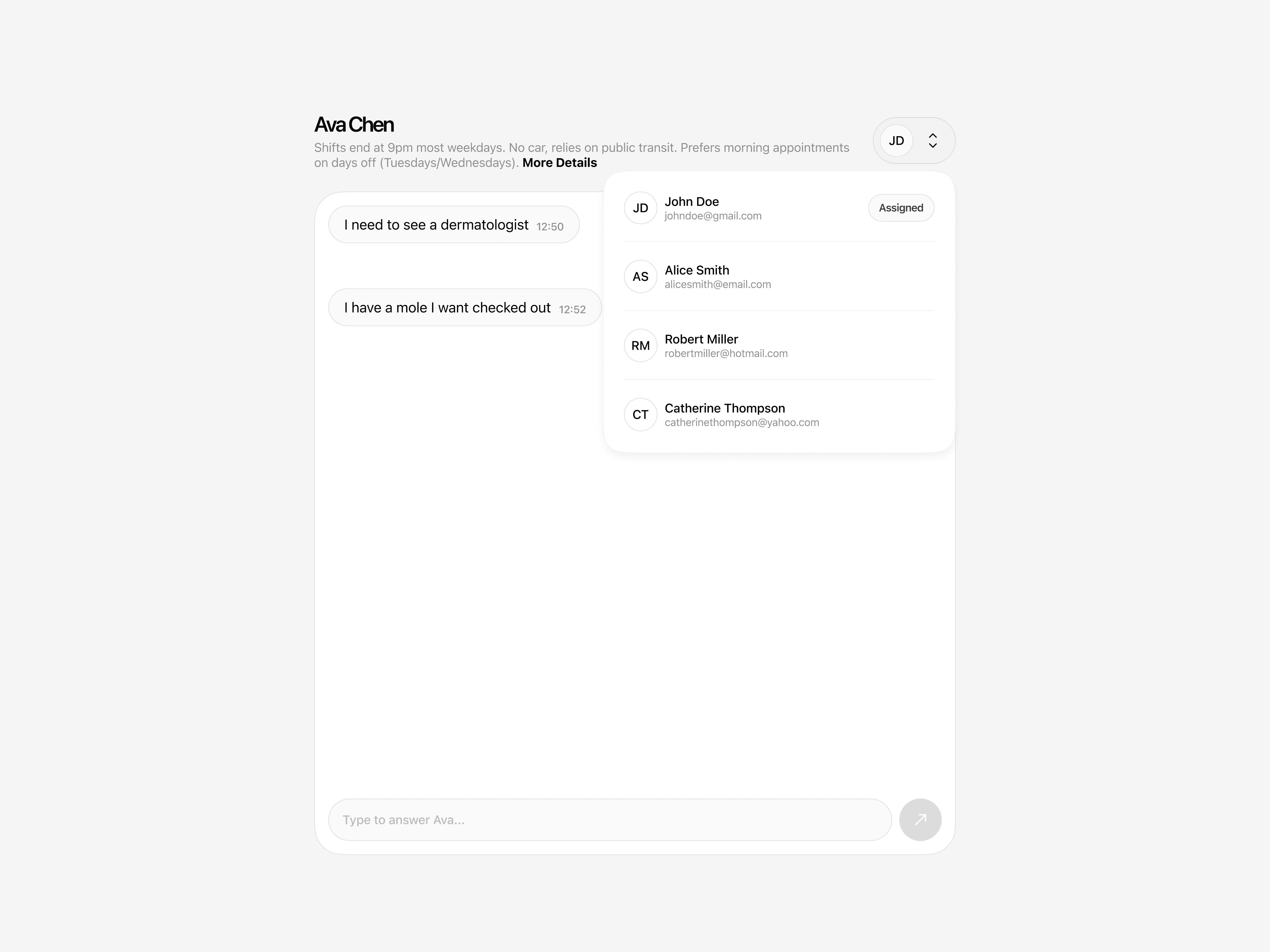
The center panel keeps each conversation legible at a glance: a short, AI-generated summary of who the patient is and what they need, so a nurse never has to read a full thread history to get context. Reassigning a conversation to another nurse takes one action, not a workflow. And the interface stays quiet everywhere else, putting the spotlight on the one thing a nurse actually has to evaluate — the AI's proposed response.

Tablet mockup

A visible, editable AI

On the right, nurses talk to Rovi's AI directly — asking it to handle an appointment, update a patient's information, create a reminder, or answer a question, in the same conversational register the AI uses with patients. And because oversight isn't fixed, nurses can move a conversation between Automated and Review mode at any time, in one action, whenever the situation calls for more or less of their attention.

Tablet mockup


Results

In the months after launch, the average time for a nurse to resolve a conversation, from opening it to signing off, dropped by about 38%. The share of conversations resolved on the first pass, without being reassigned or stalling mid-thread, rose from roughly 65% to 91%. New nurses also reached full working speed about 48% faster than they had on the old dashboard.


Create a free website with Framer, the website builder loved by startups, designers and agencies.